
Gate510
Project Overview
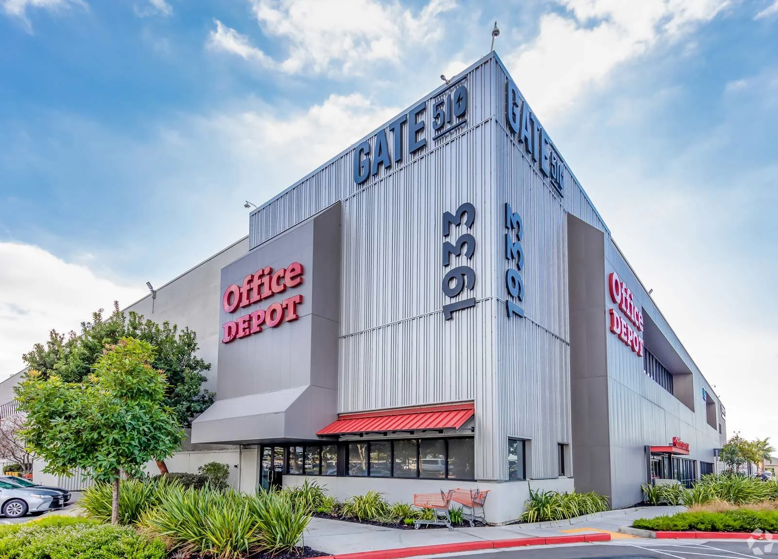
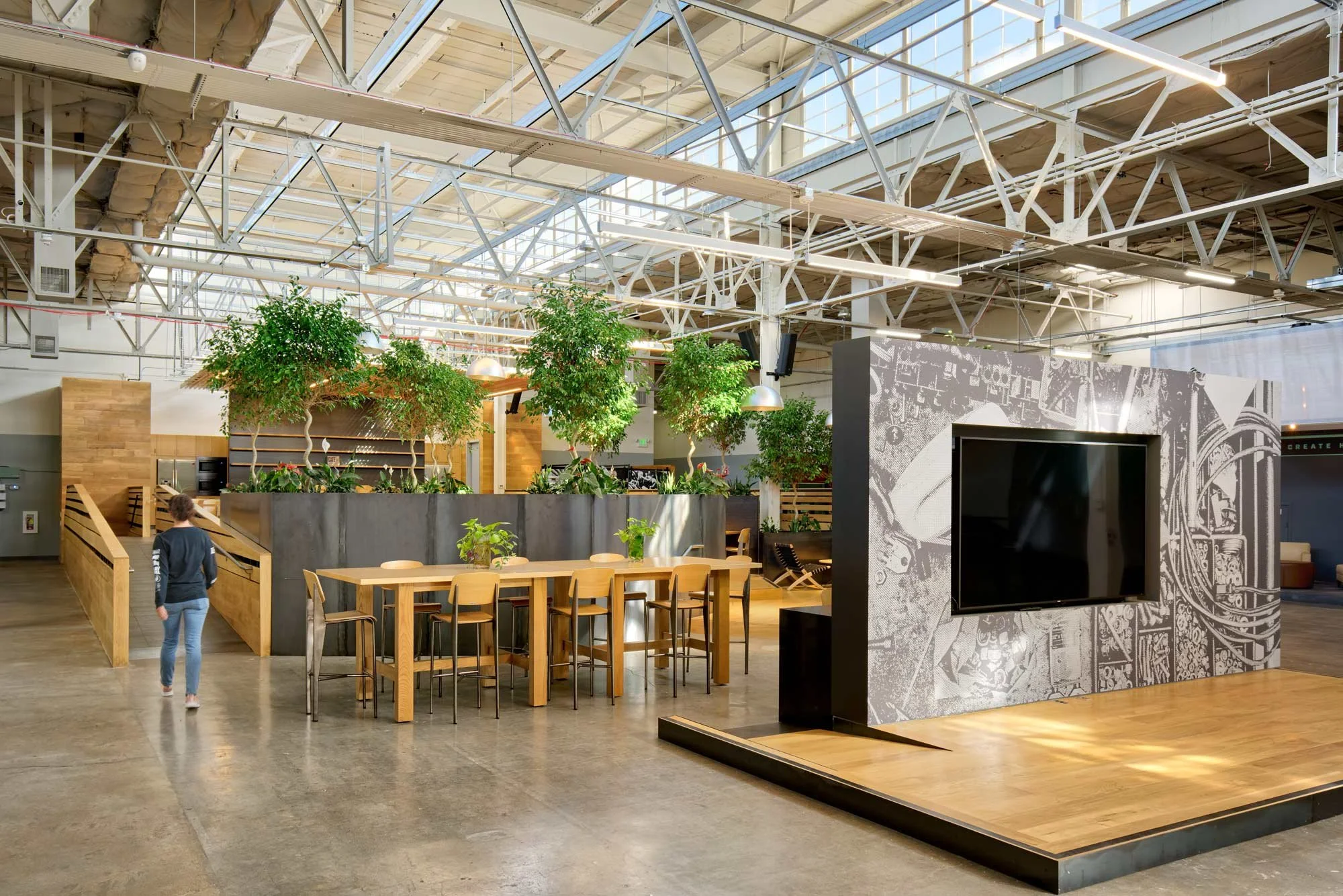
Gate510 is a 300,000 SF innovative industrial hub in the East Bay, home to over 80 tech and artisanal entrepreneurs, makers, creators, and manufacturers. When we were engaged to reposition the property, it was suffering from an identity crisis — a vibrant, diverse community of businesses existed within its walls, but none of that energy was visible from the outside. The brand wasn't communicating its value proposition, and the physical space was vast, confusing, and hard to explain to prospective tenants. The opportunity was significant: elevate what was already there, make it legible, and turn a hidden gem into a destination worth seeking out.
My Role
Lead Designer

My Role
I led brand strategy, identity, signage and wayfinding, environmental graphics, collateral, and website — owning the project end-to-end from strategic repositioning through environmental execution. That meant thinking simultaneously at the brand level and the building level: developing the identity system and then designing the physical experience of moving through 300,000 square feet of space.


The Brand system
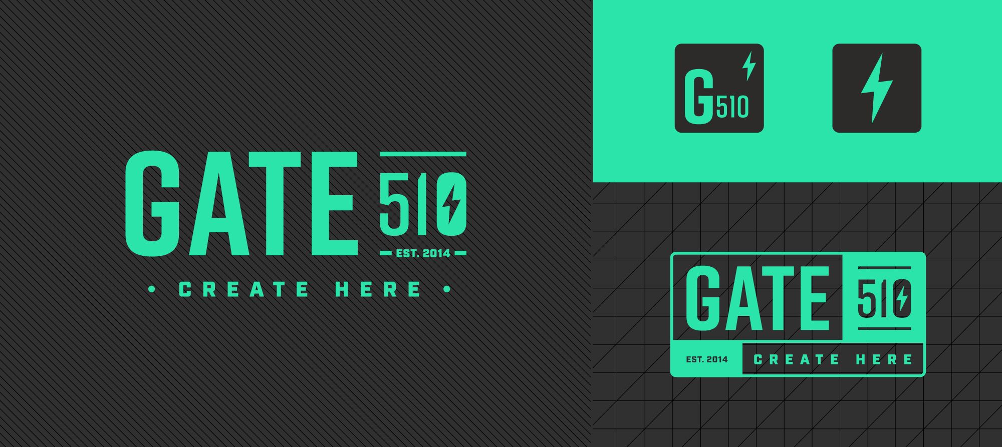
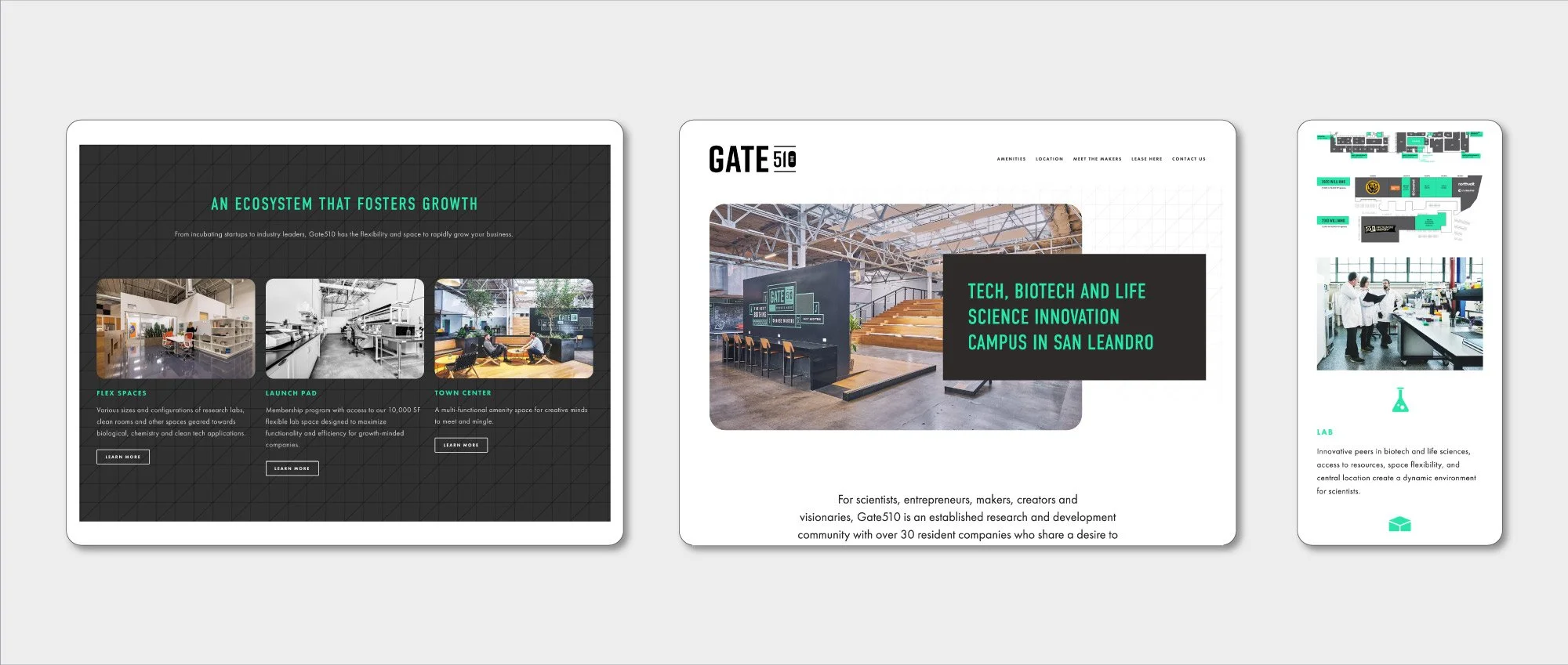
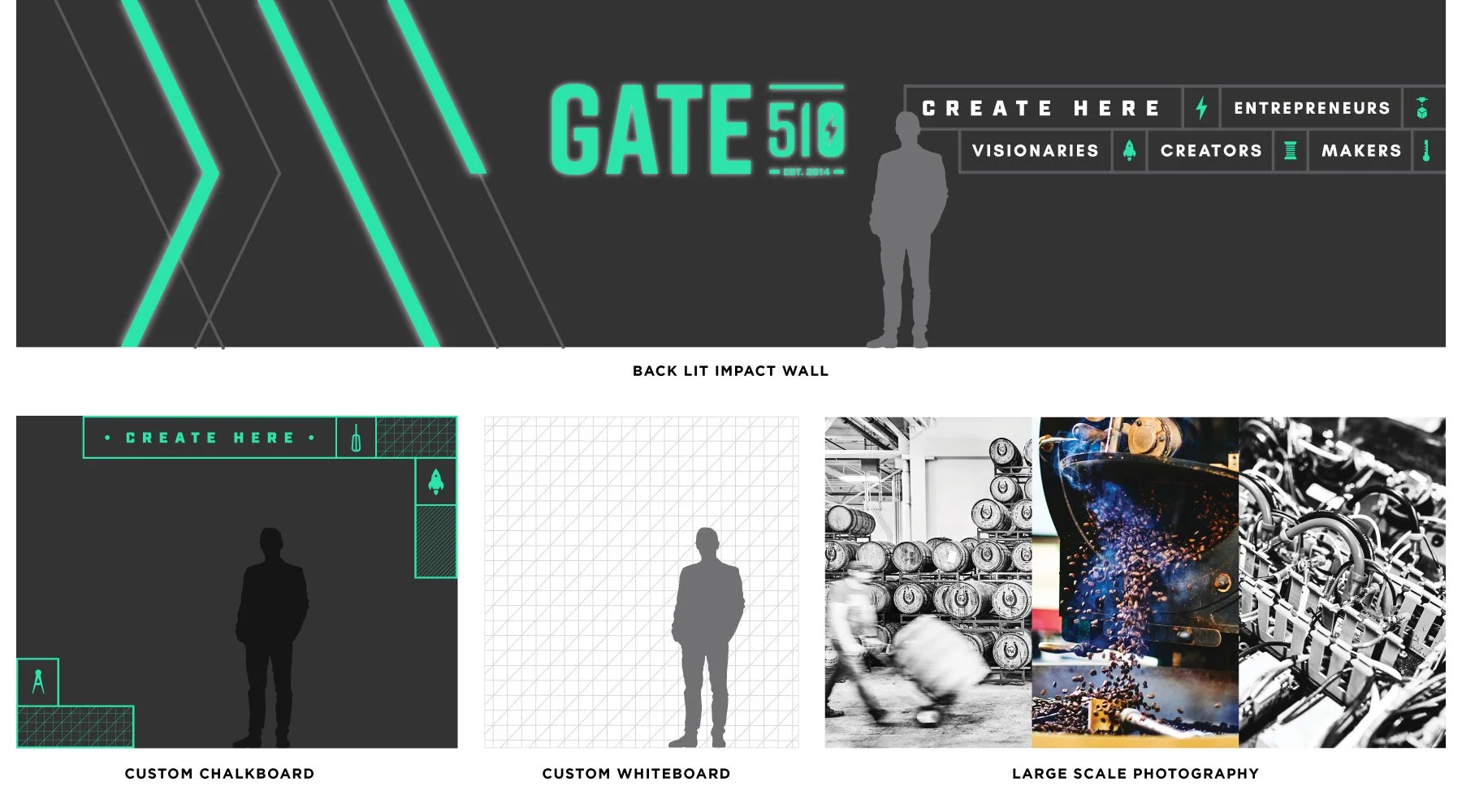
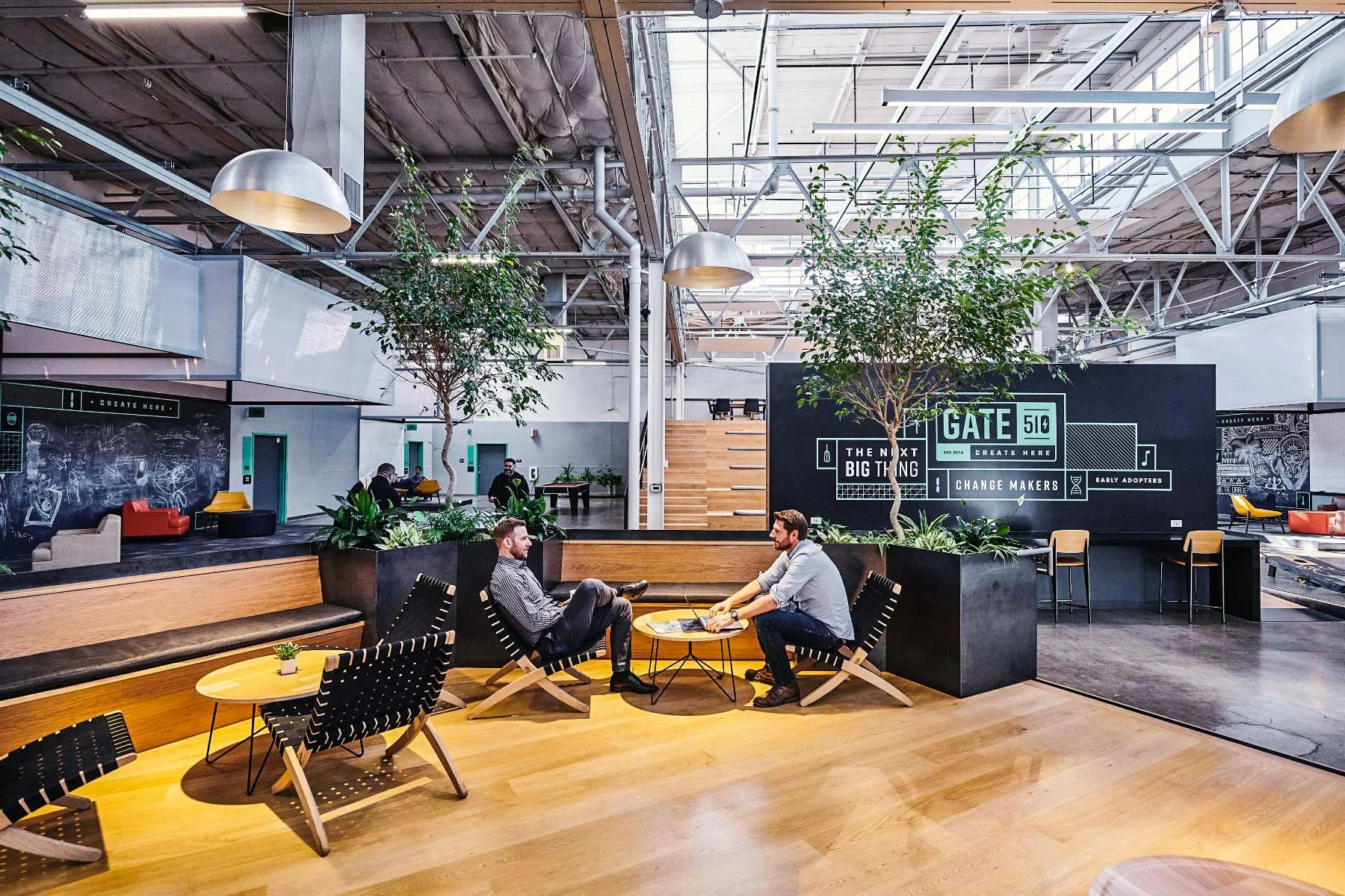
The Gate510 identity was built to be vibrant, tech-inspired, and bold — a brand that could stand out in a competitive landscape while genuinely reflecting the energy of the community inside. The palette of black, grays, and a distinctive vibrant green gave the brand authority and edge without alienating the breadth of industries it needed to serve.
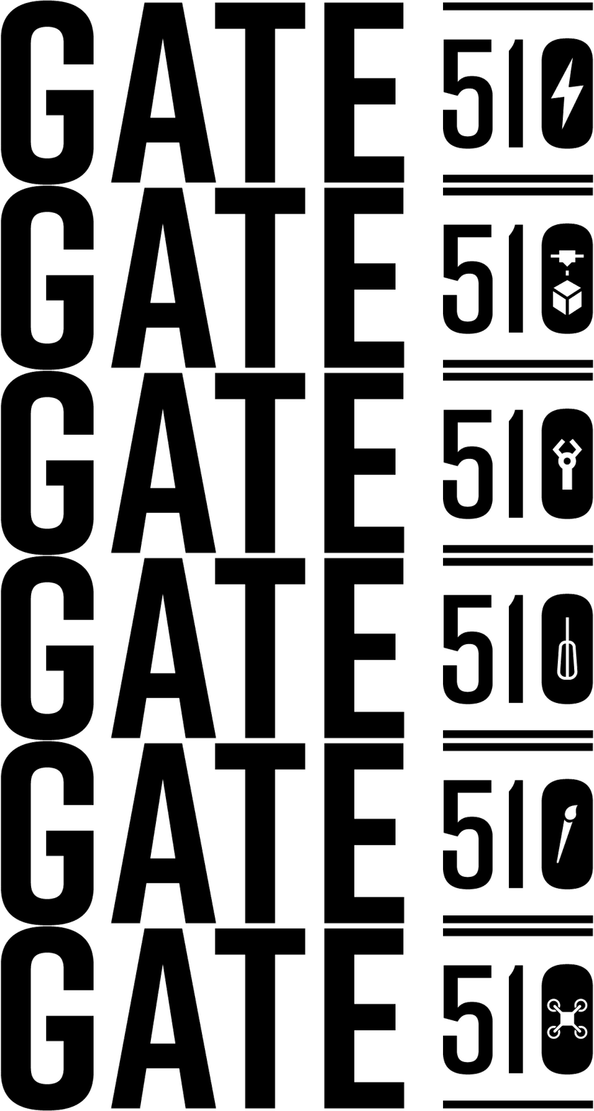
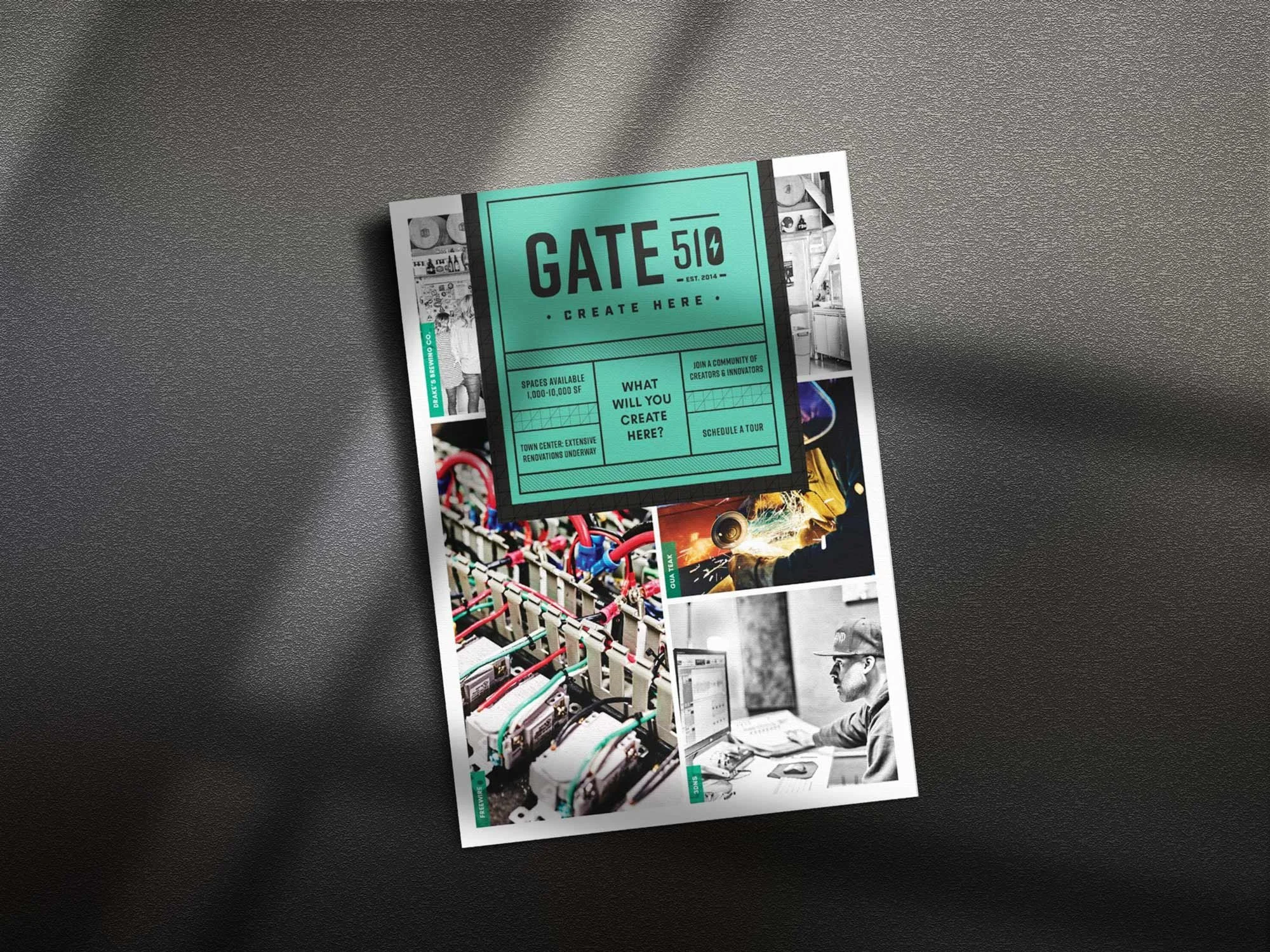
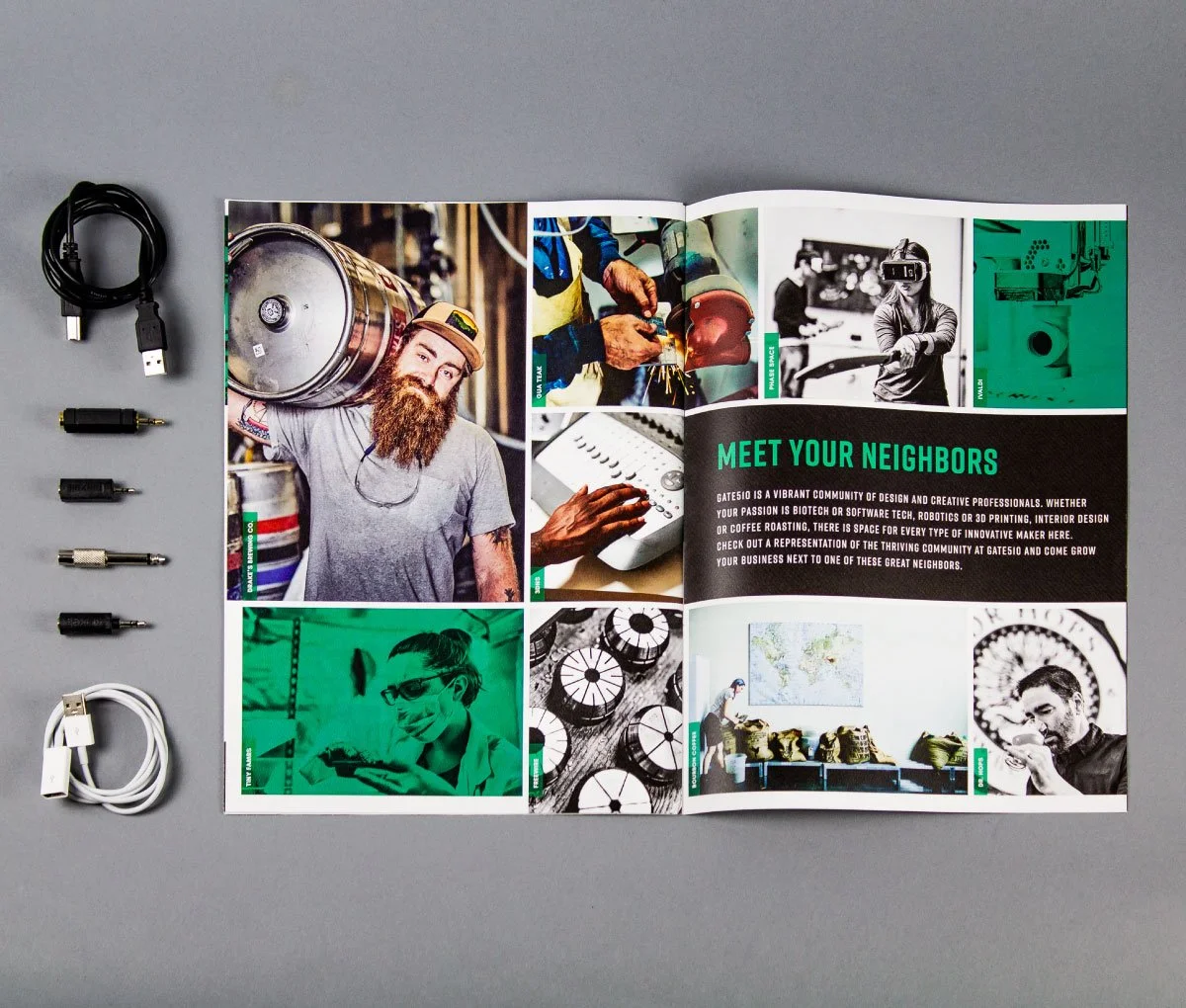
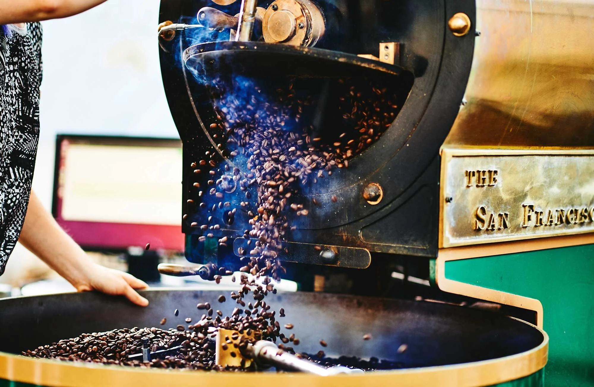
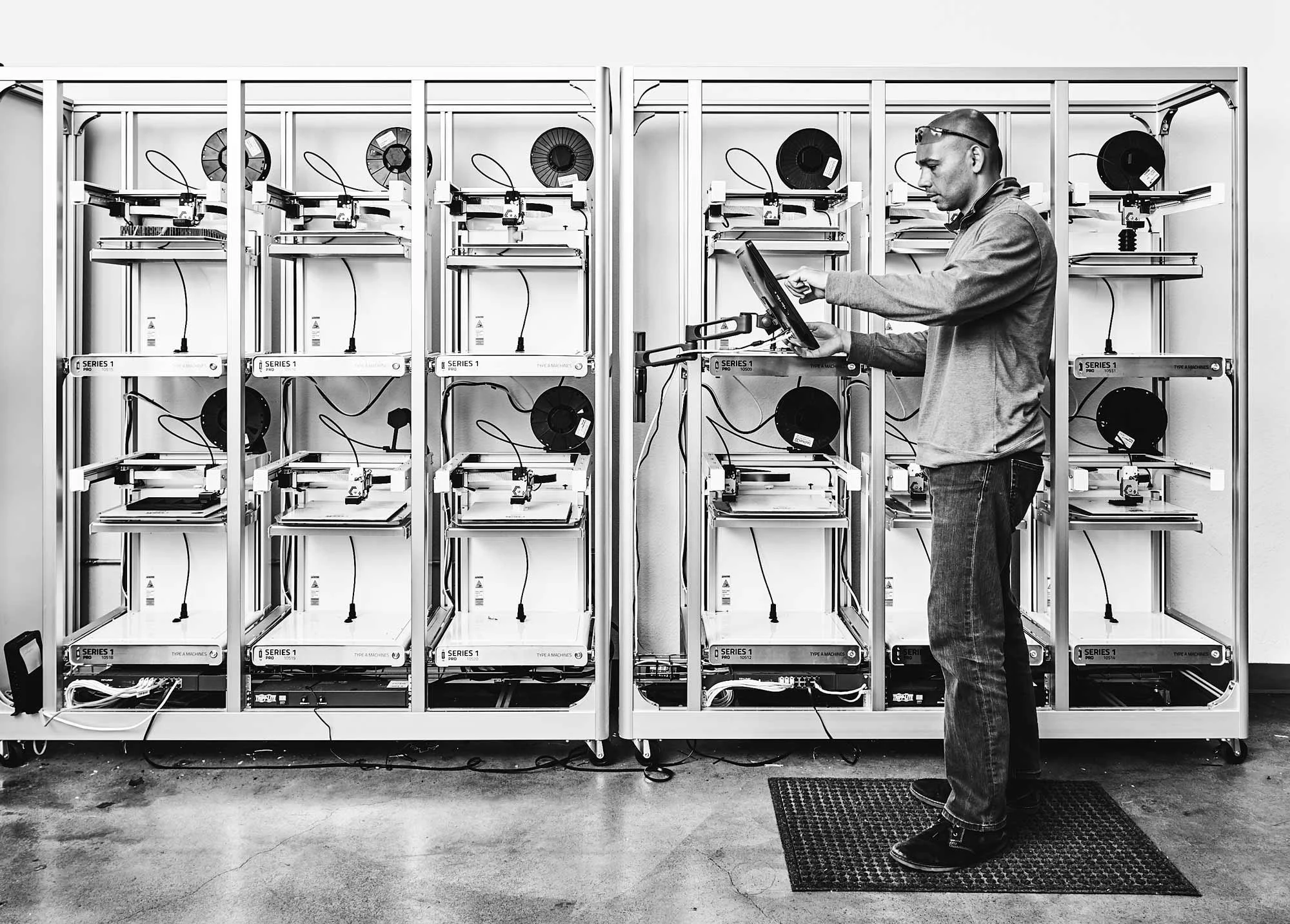
The mark itself was designed to represent that breadth — the range of startups, entrepreneurs, makers, and industries thriving under one roof. From there, the system extended across every touchpoint: logo and identity, collateral, website, social media templates, photography, signage, digital directories, and a full environmental wayfinding system. Top-notch photography from Aaron Lee brought the tenant community to life, making the invisible visible and giving ownership a sustainable, replicable set of brand assets to drive leasing and cross-promotion.
Creative Rationale
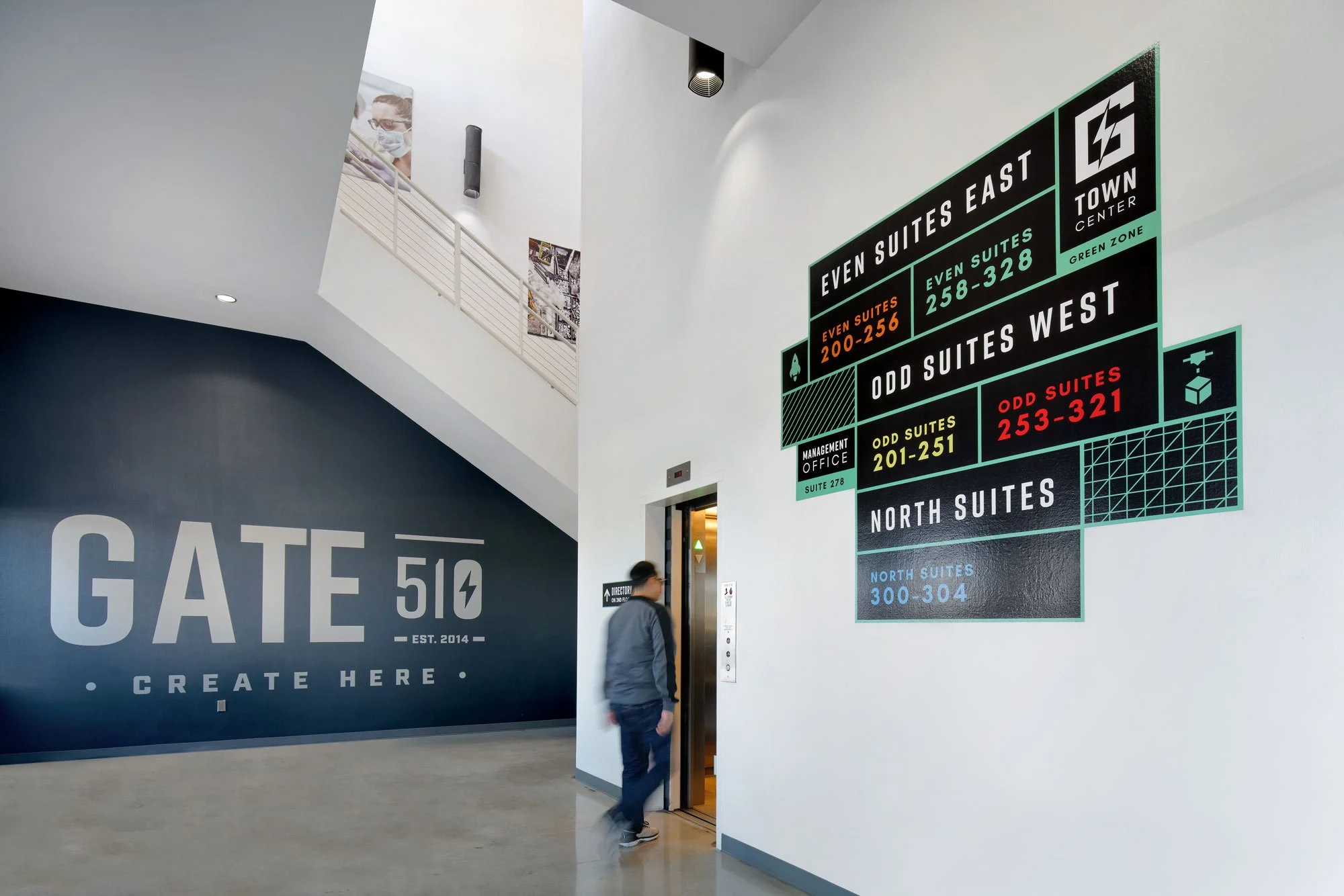
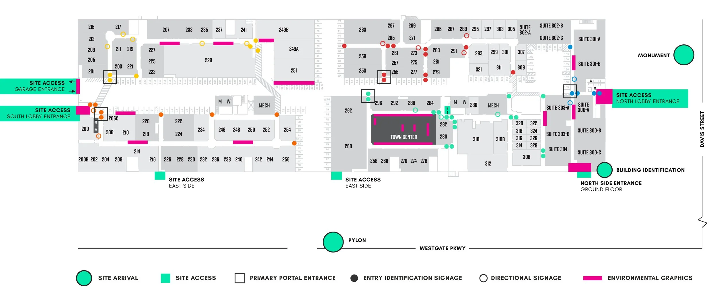
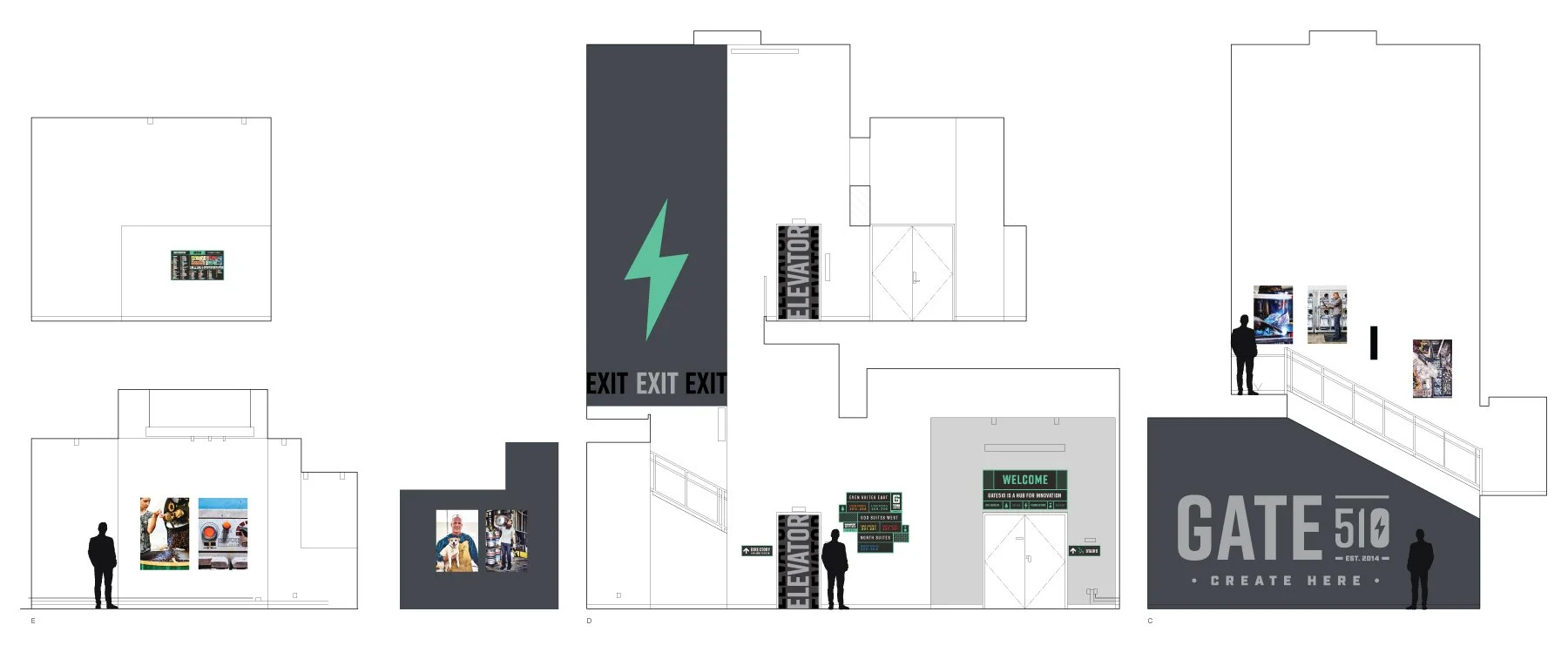
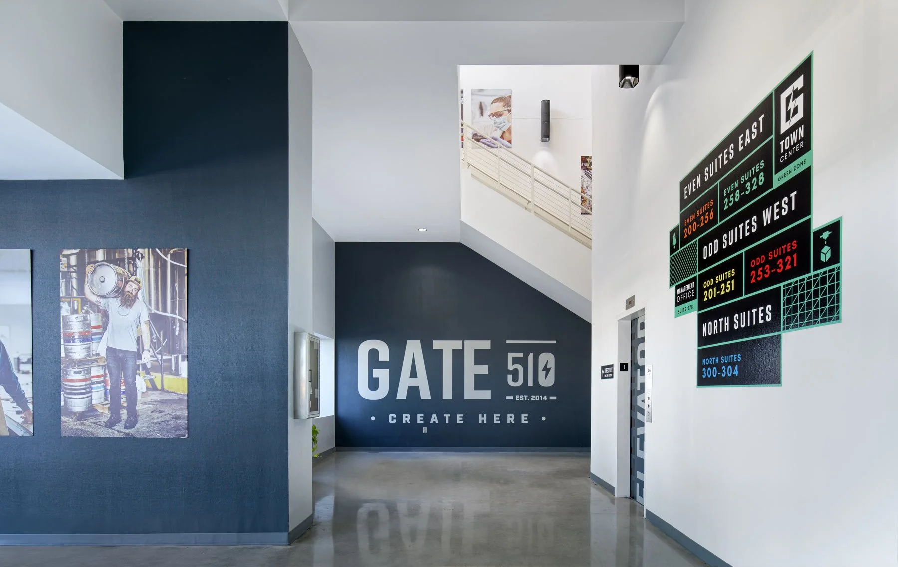
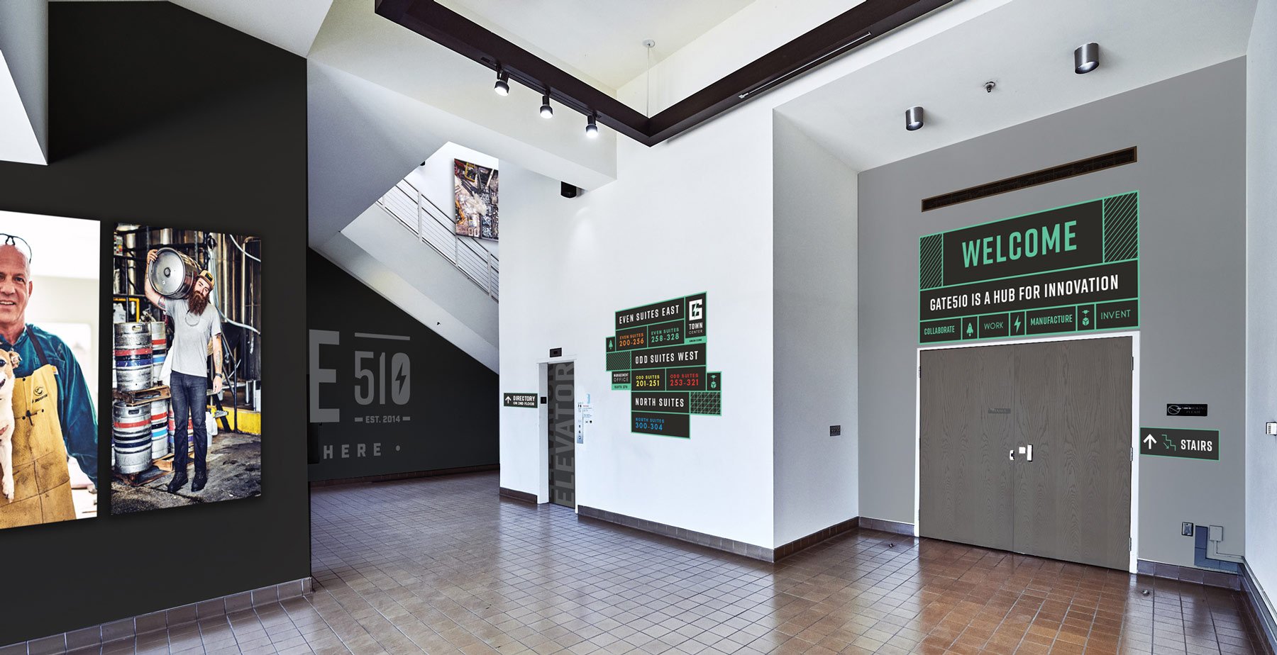
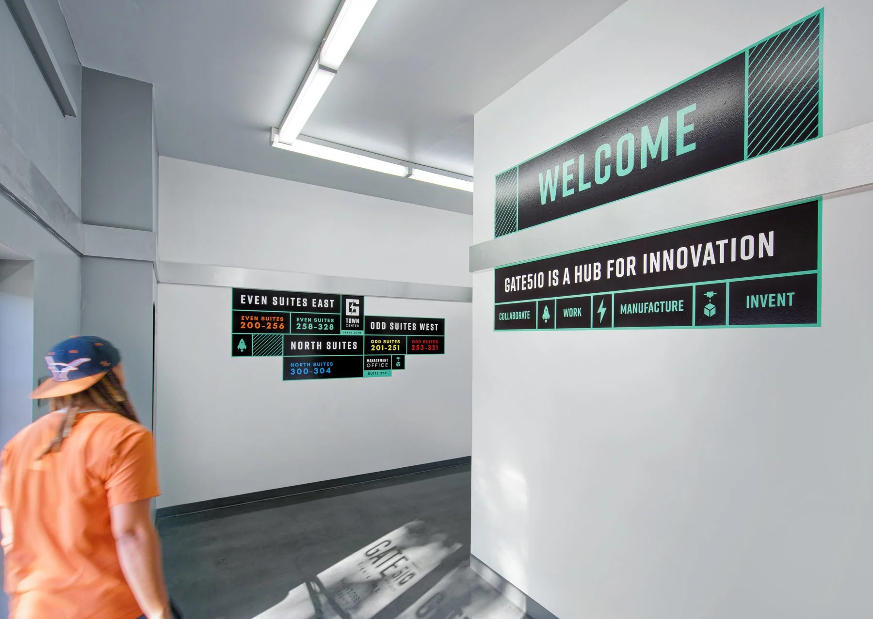
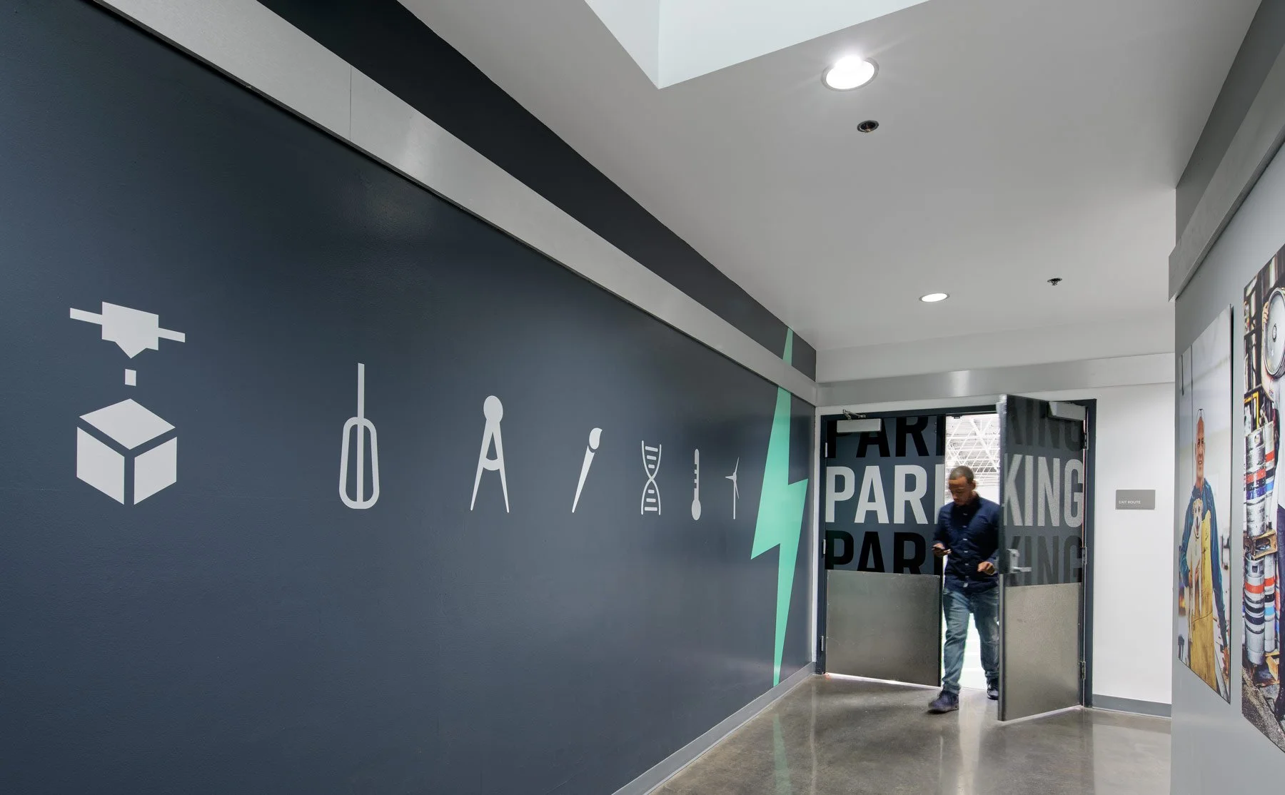
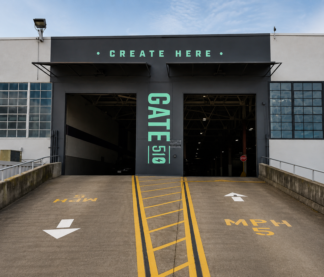
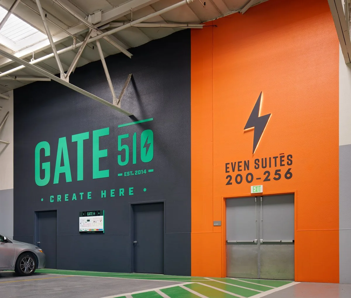
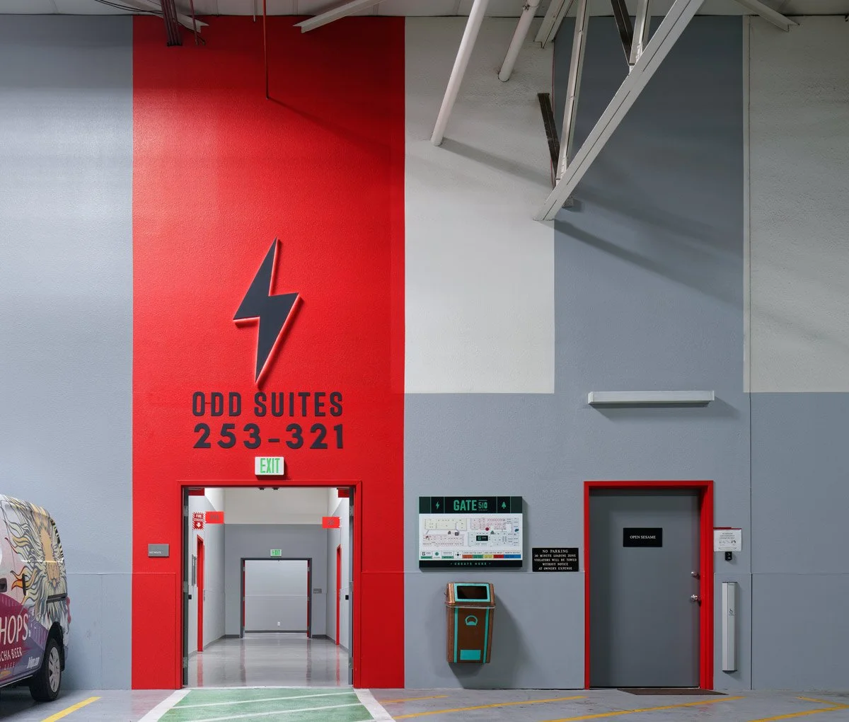
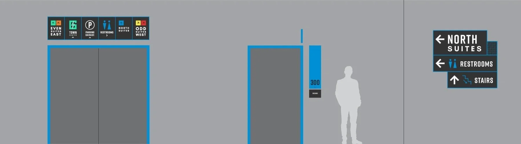
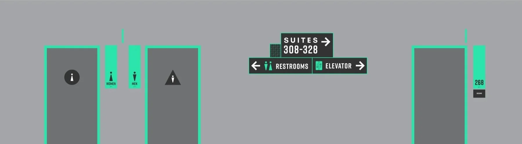
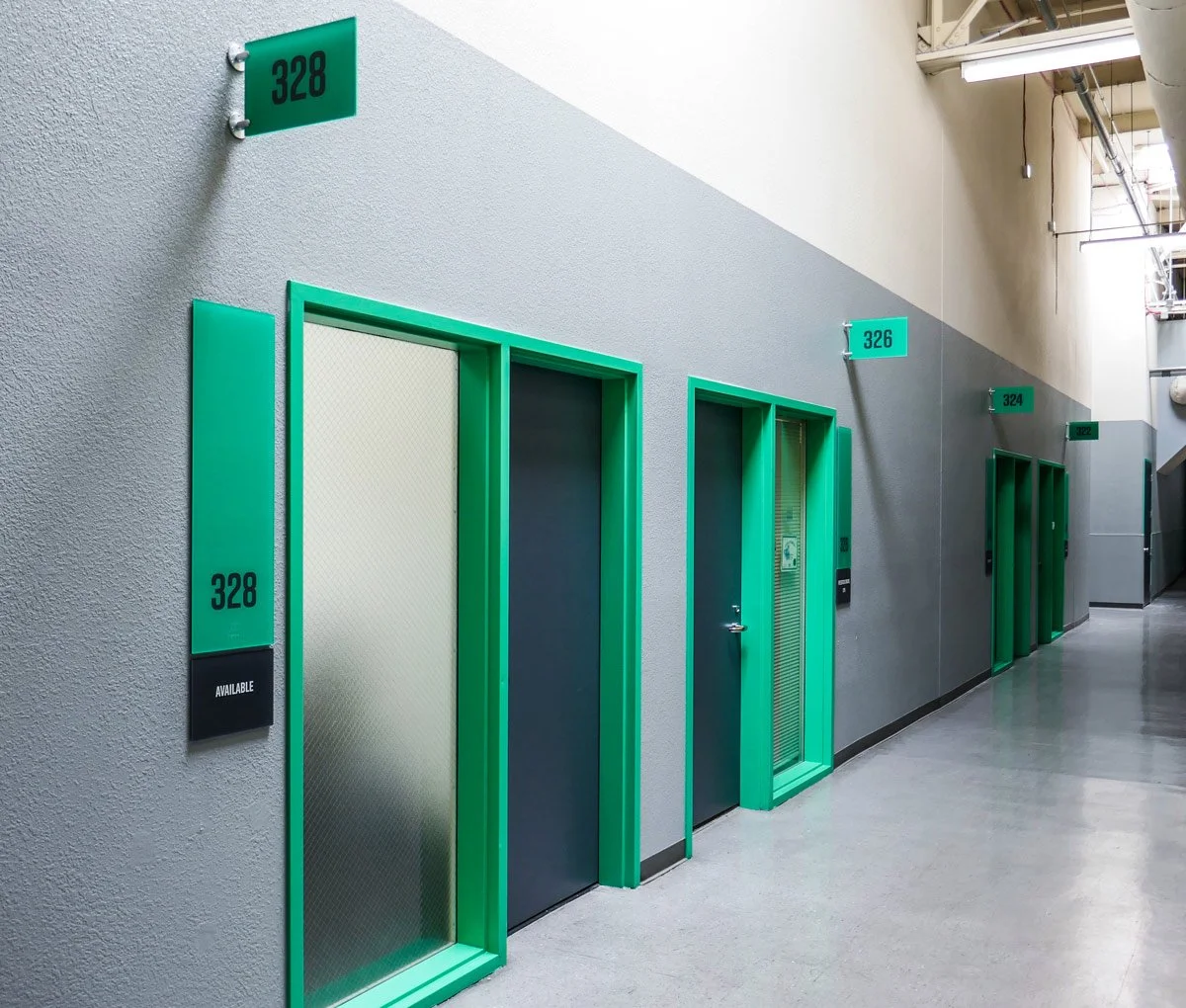
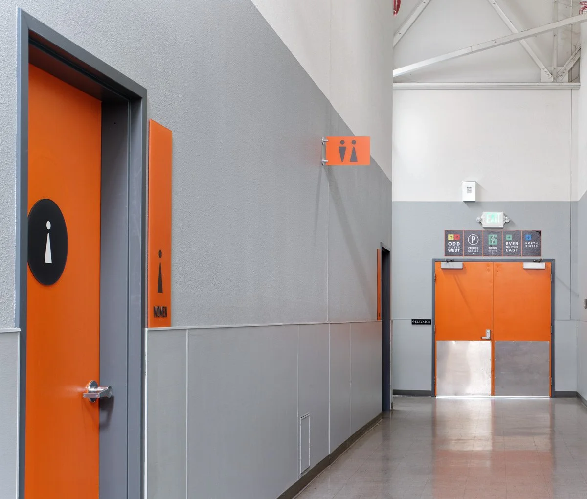
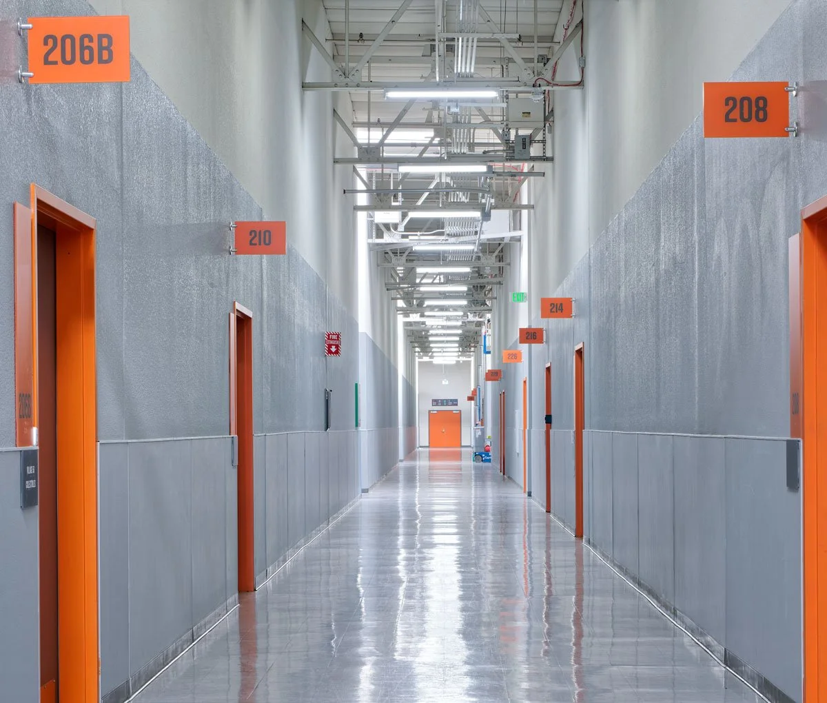
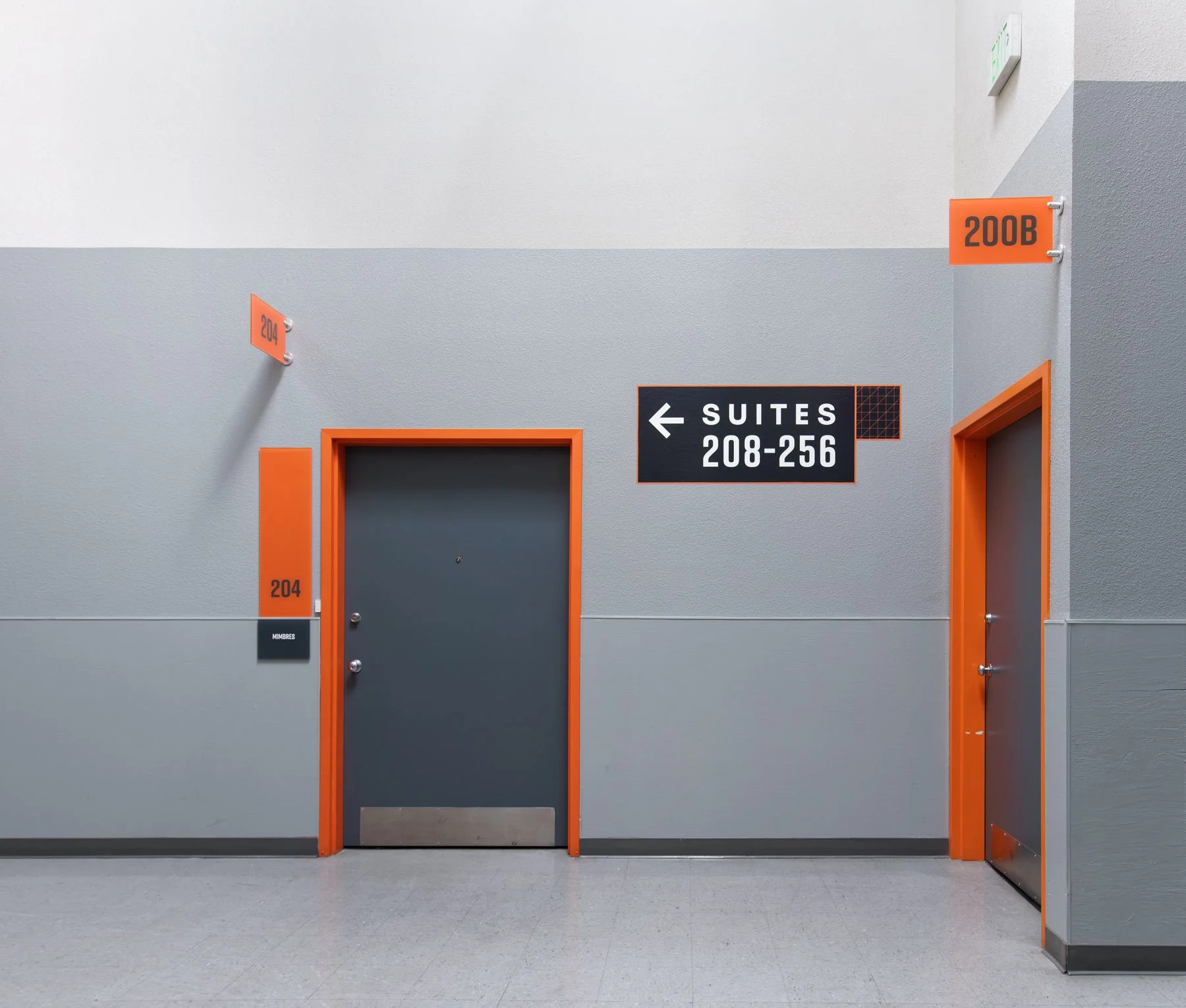
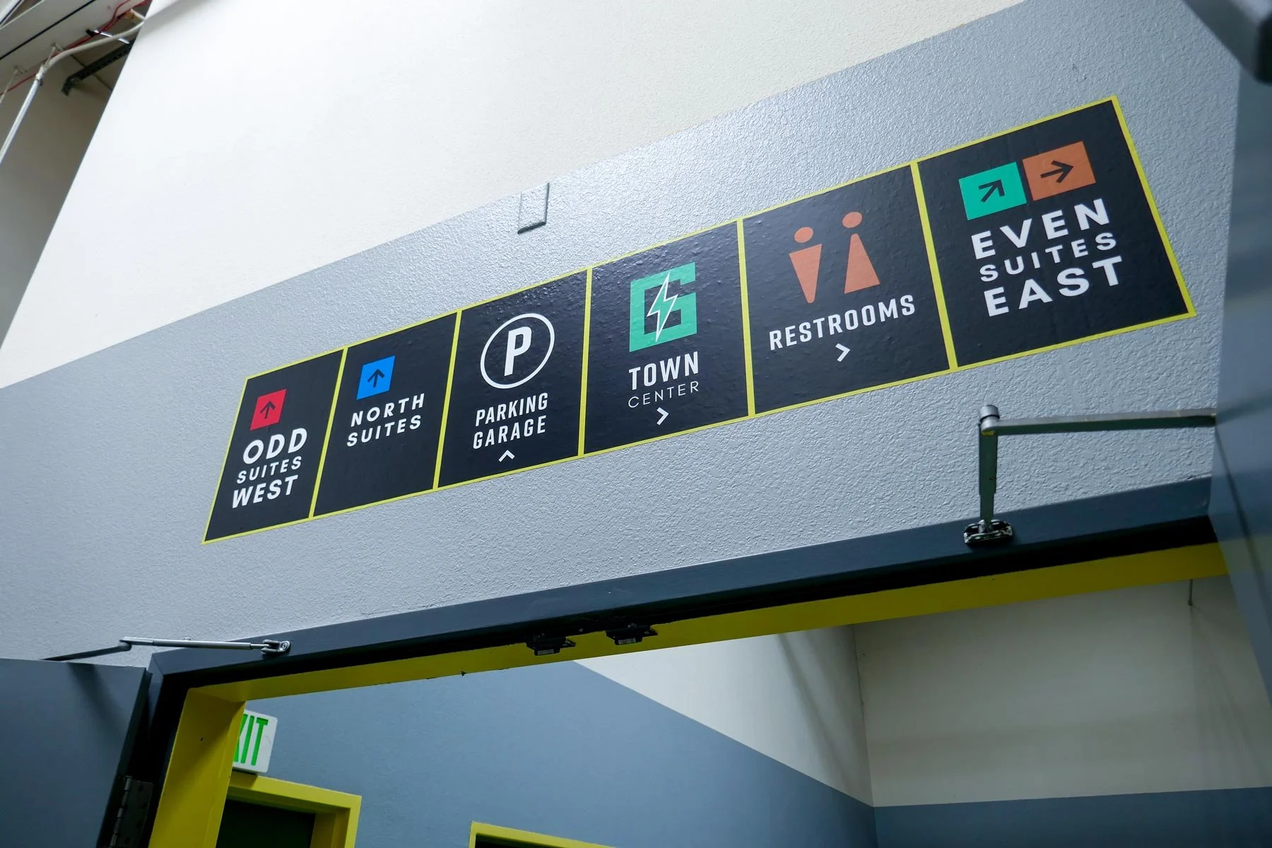
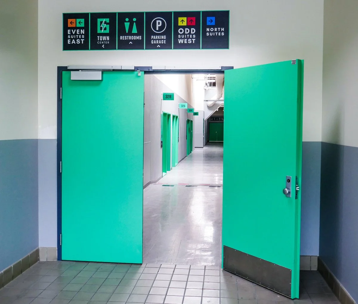
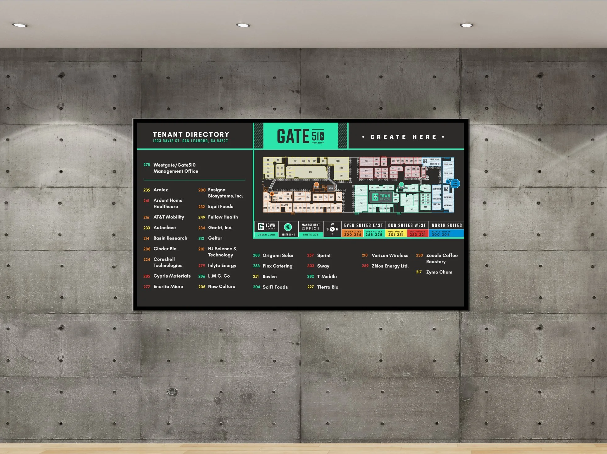
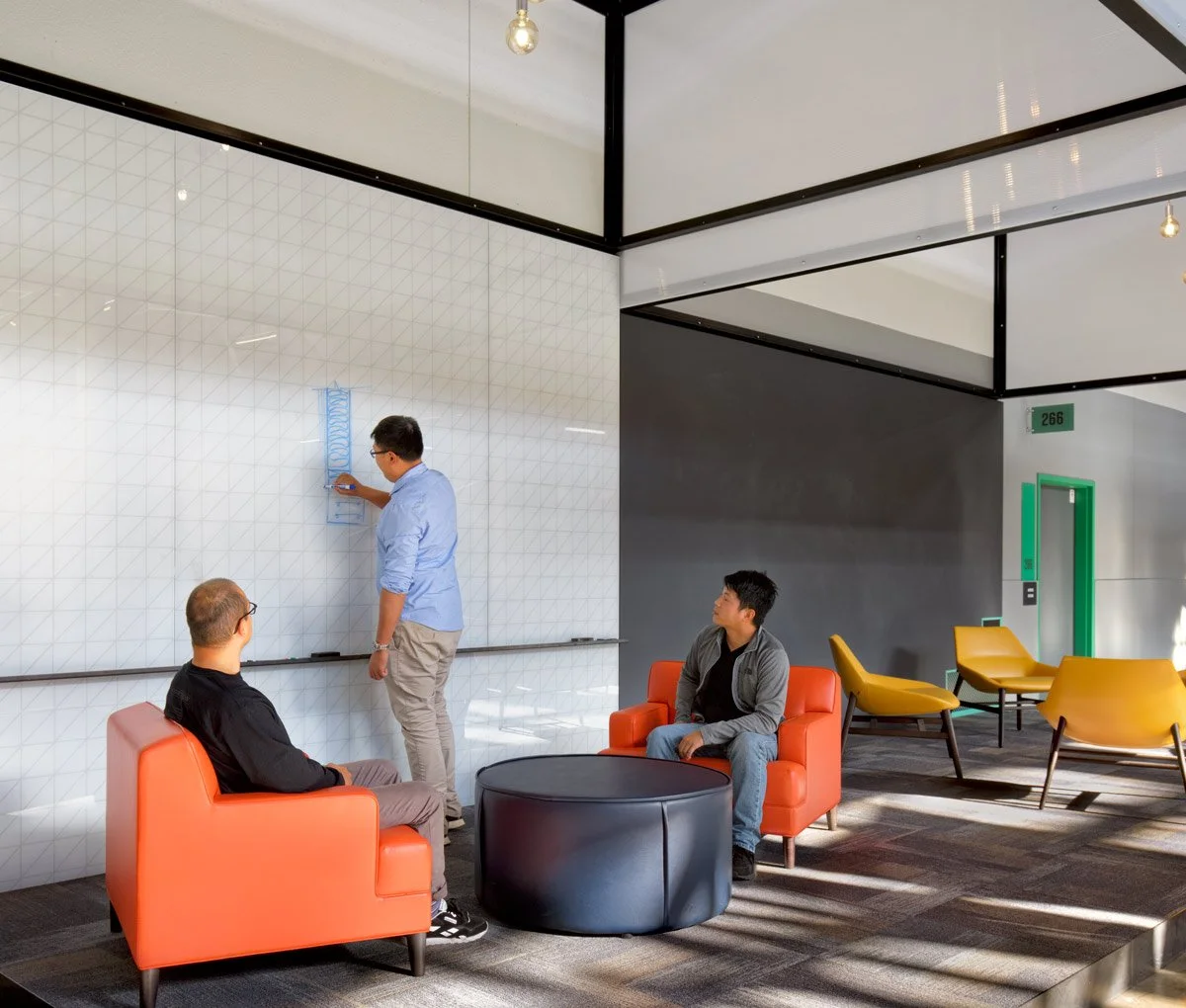
The wayfinding challenge was uniquely complex: the building's suite numbering system was non-sequential, couldn't be renamed or reorganized, and offered visitors almost no intuitive way to navigate. Rather than fight the numbering, we built a color-based system on top of it. The property was divided into five color-coded neighborhoods, with each color functioning as a visual thread — running through directory signage, wall graphics, and wayfinding cues from the parking garage entrance all the way through the corridors — so that a visitor looking for a specific quadrant could follow color rather than numbers.
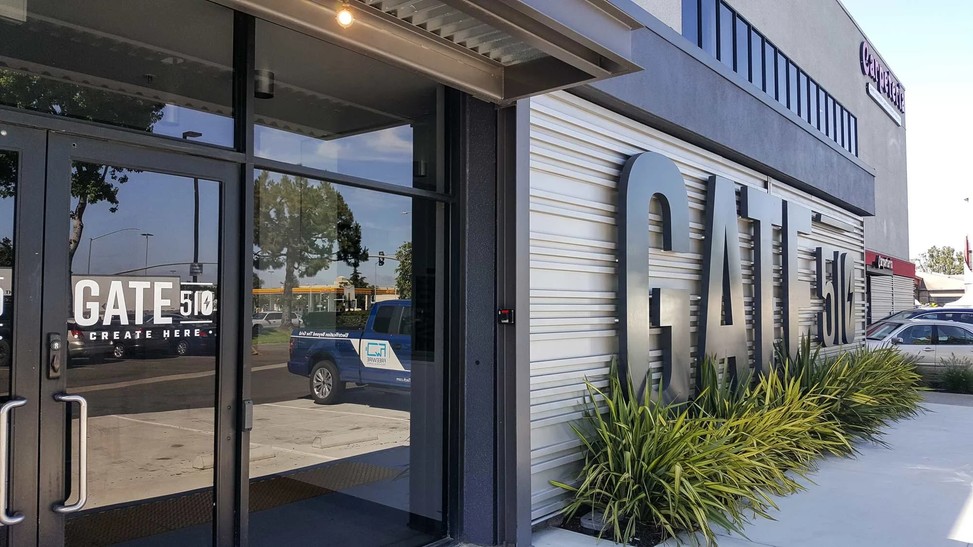
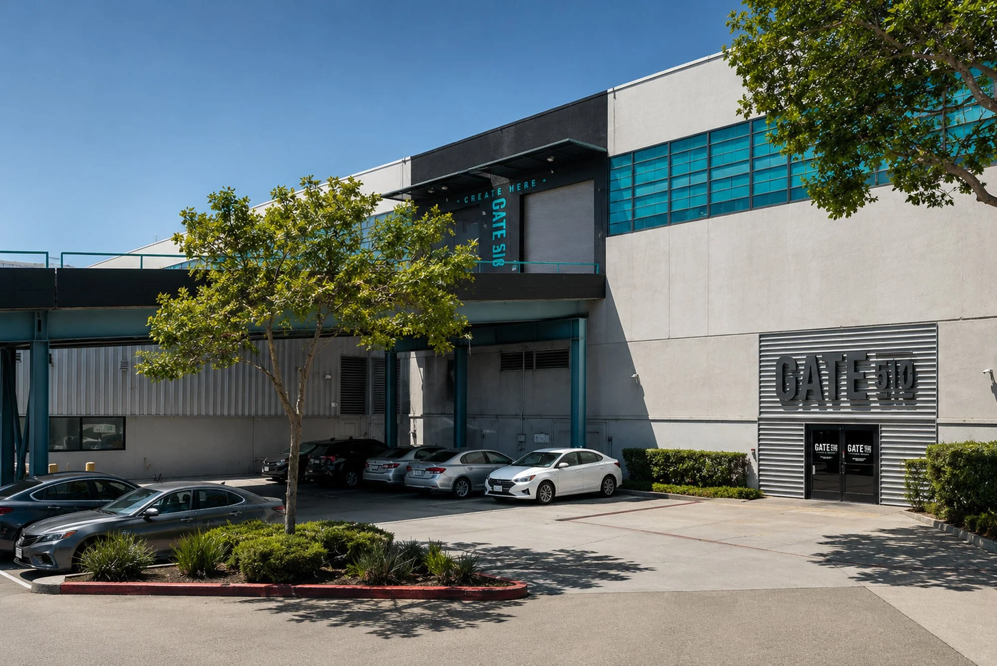
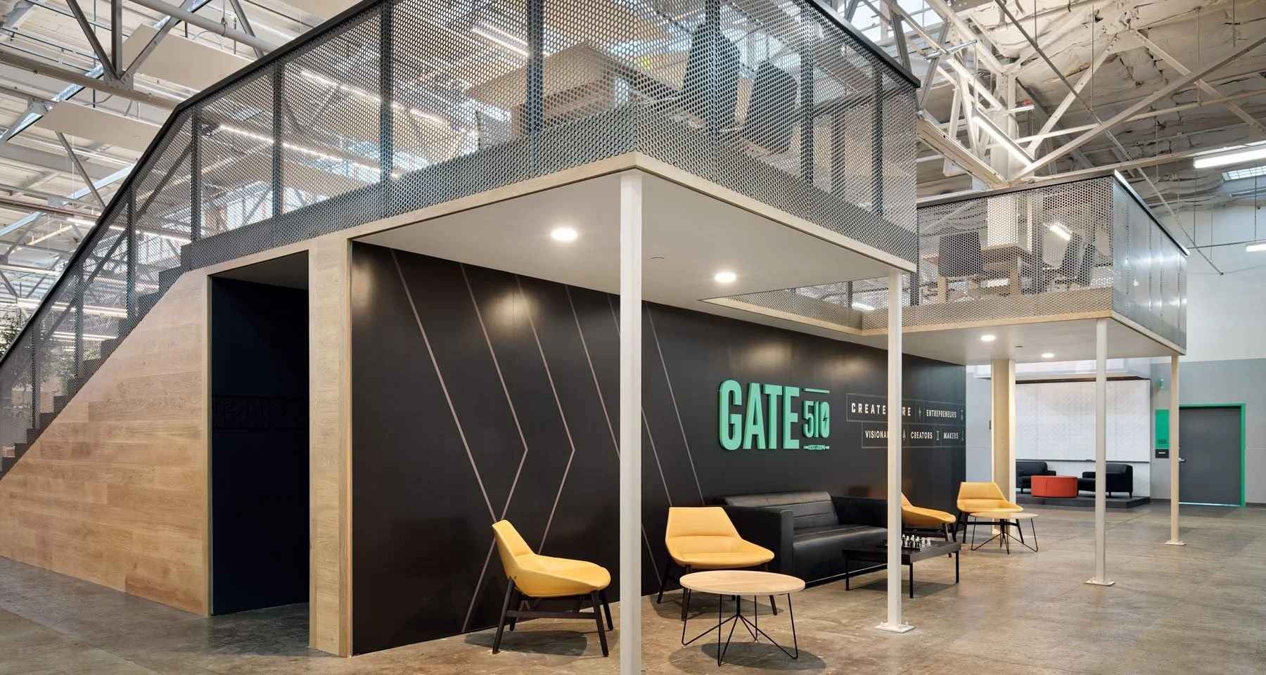
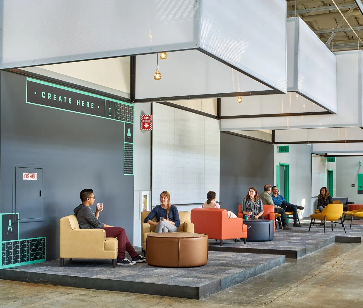
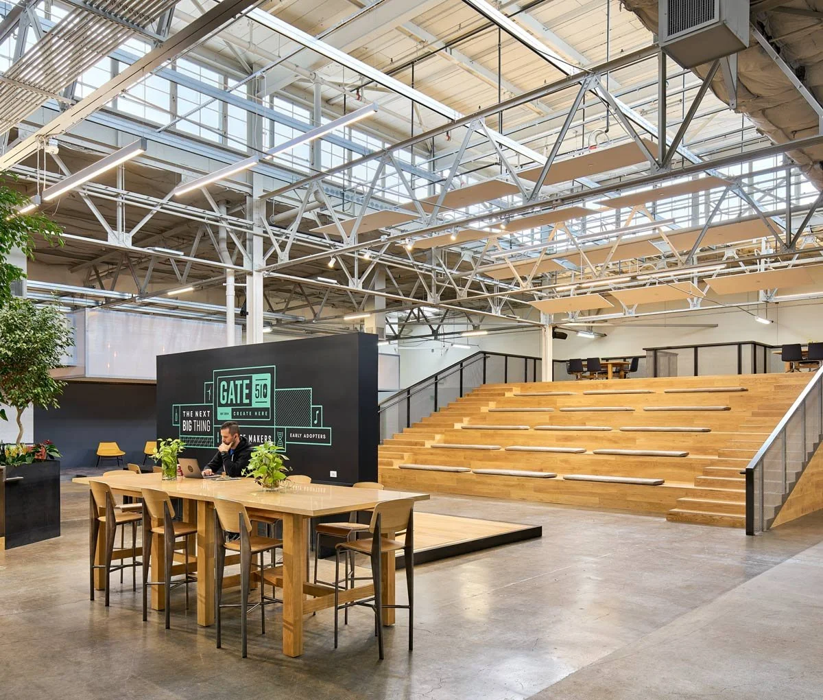
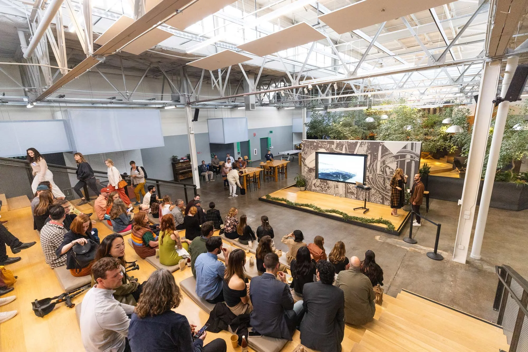
The three lobby entrances, previously dated and barren, became brand moments: blank walls transformed into introductions to the energy and creativity of the tenants within. Playful neon signs marked each parking garage entry point. The 8,000 SF Town Center was redesigned as the heart of the community, integrating the full visual brand to reinforce Gate510's identity as a place where invention actually happens. Every decision — from icon design to color assignment to corridor graphics — was made in service of one goal: turn a confusing, invisible property into something people could understand, navigate, and want to be part of.

Indigo Awards 2023, Gold in Branding for Graphic Design
Indigo Awards 2023, Gold in Wayfinding; Silver in Branding for Graphic Design; Silver in Branding for Real Estate
Recognition
Project Team
Creative Director: Jennifer Bryan
Content Strategist: Jamie Bourgidu
Lead Designer: Danielle Breck
Junior Designer: Nathan Bergfelt
Designed under the direction of Think Joule.
Project partners
SKB
Aaron Lee